How I Added Shopify Color Swatches Without Touching Theme Code
I’ve seen this happen enough times that I treat it as a layout problem, not a merchandising problem: a store has good products, but color choices sit behind a dropdown and the page never feels easy to shop.
Supra Swatch Colors is the app I’d use when I want swatches to feel native instead of bolted on. It handles variant swatches, linked-product swatches, and collection-page swatches without code, and it gives enough control over size, tooltip, label, shape, and style to match the theme.
What I usually want from a swatch setup:
- make the color choice obvious in one glance
- keep the product page fast and clean
- support collection browsing
- avoid theme edits that have to be undone later

Start With The Right Swatch Model
If you choose the wrong model, everything downstream gets messy.
A useful shortcut:
- Use variant swatches when the product is the same item in different colors.
- Use linked-product swatches when each color deserves its own product page, photo set, or SKU.
- Use collection-page swatches when shoppers compare options before they click in.
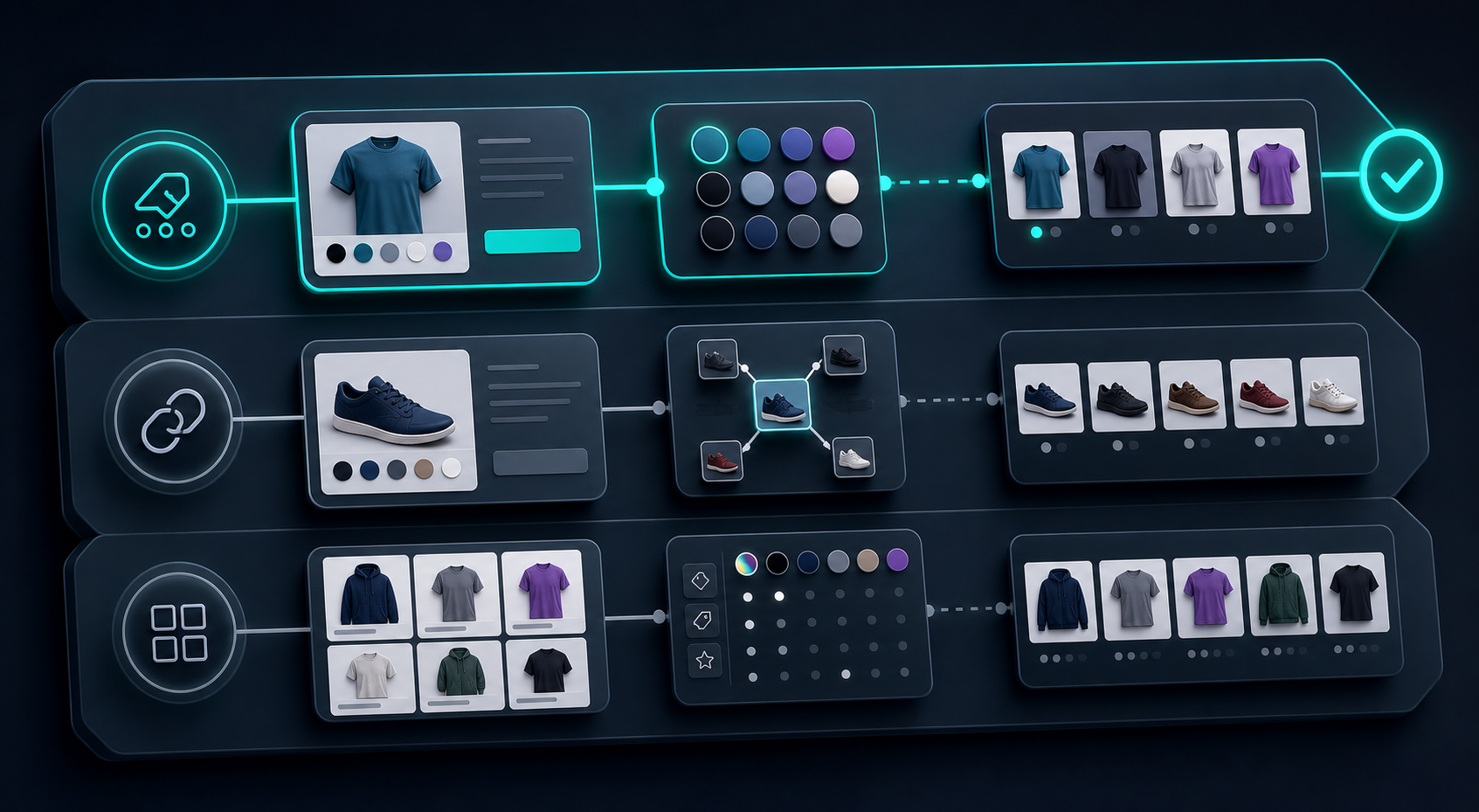
That is the real decision point. The app can support all three, but the cleanest store is the one that does not force every color difference into the same pattern.
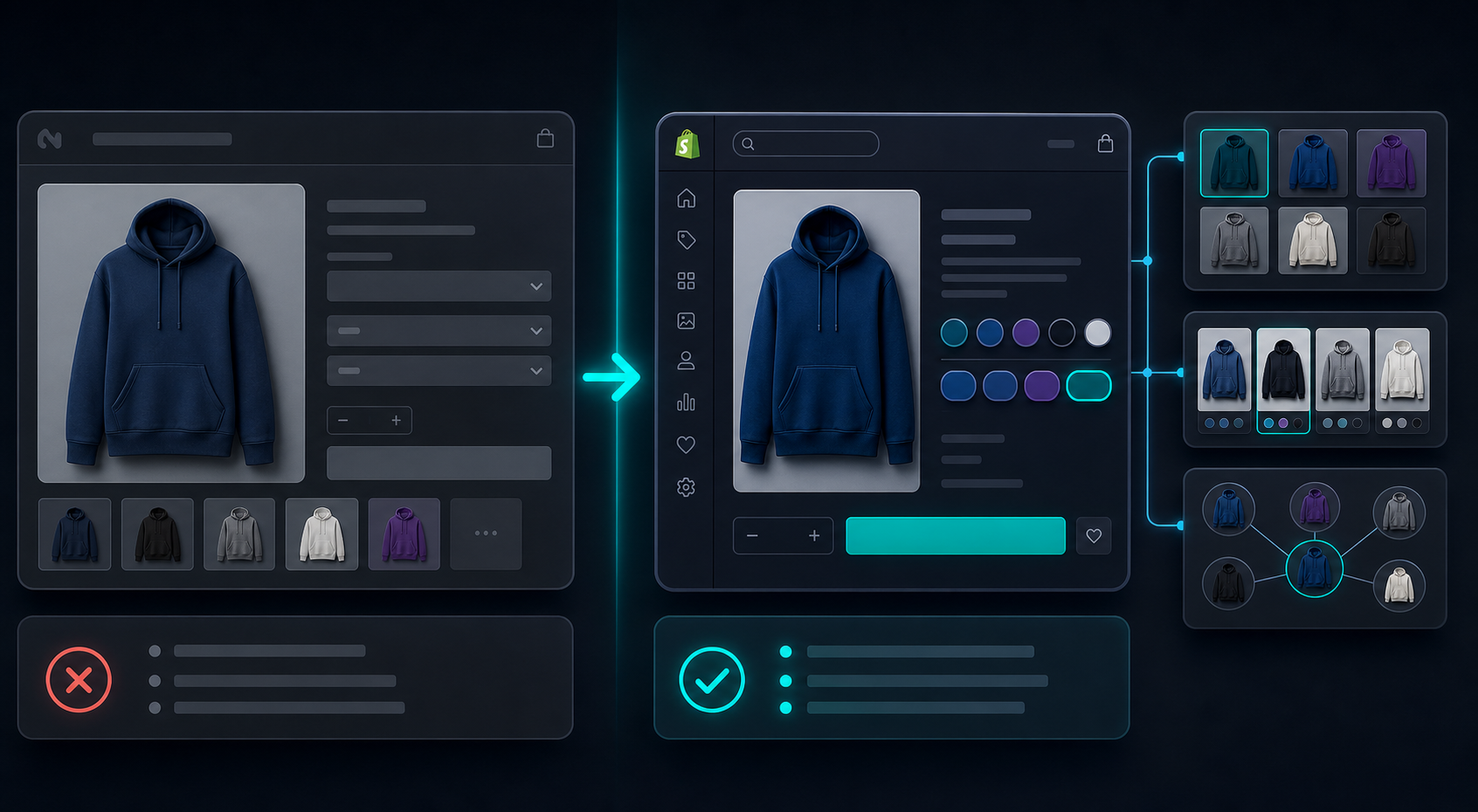
Make The Swatches Feel Native
My test is simple: does the product page still look like the same storefront after the swatches load?
Supra Swatch Colors is useful here because you can tune the visual details instead of accepting a one-size-fits-all widget. Auto-detecting colors helps when the catalog already has strong color names. Using product images for swatches is better when the shade is hard to describe or the chip needs to match the actual item. The app also supports multilingual shops, which matters if the rest of the storefront is already localized.

Small details matter:
- keep swatch size consistent across templates
- make the tooltip readable on mobile
- use the same shape language across categories
- do not let one collection page use rounded chips and another use tiny squares unless there is a reason
The app claims 20+ customizable styles, and that flexibility is the point. I would rather spend a few minutes matching the theme than force the theme to adapt to a generic widget.
Collection Pages Are Where Swatches Usually Pay Off
Collection pages are where you win or lose the first click.
If shoppers can see the color options before they open the product, you cut one decision step out of the journey. That matters most when the store has many similar products, or when each product comes in several colors and the grid otherwise looks repetitive.

I like collection-page swatches for two reasons:
- they make the catalog feel easier to browse
- they reduce the “click in, back out, click again” loop
That is not just a UX nicety. On a busy storefront, it is the difference between a quick scan and a slow one.
Fix The Image Layer First
Swatches only work as well as the images and product naming around them.
If the product photo set is weak, color swatches can actually make the page feel less trustworthy. In practice, I try to fix the imagery before I tune the swatch style. That usually means building one repeatable image workflow and then reusing it across the product catalog.
I have written about a few parts of that pipeline already:
- How to Turn Plain Product Photos Into Studio-Grade Shopify Visuals
- How to Build a Shopify Image System for Catalogs, Ads, and Try-Ons
- How I Cut Product Photo Prep Time for Shopify Without Hiring a Designer
- How I Turn One Product Photo Into a Shopify Asset Pipeline
If you are still deciding how far to push the visual layer, how to decide which Shopify products deserve 3D models first is a good filter. The rule is the same either way: use the simplest visual system that helps the shopper make the right choice faster.
My Rule Of Thumb
When I am choosing a swatch setup, I use this order:
- Start with the product page.
- Add linked-product swatches only when the differences deserve separate pages.
- Turn on collection-page swatches if browsing is a major traffic source.
- Keep the style visually quiet enough that the product still feels like the main thing.
That is the setup I would trust for most small and mid-size Shopify catalogs. It stays readable, it does not require a theme project, and it gives the store more ways to show the difference between products without making the layout heavier.
If you want the shortest path from “dropdowns everywhere” to “the store feels easier to shop,” install Supra Swatch Colors on the Shopify App Store, test one product group, and then roll the same pattern across the collection pages that matter most.
That is usually enough to tell whether swatches are helping or just adding decoration.