How to Build a Shopify Image System for Catalogs, Ads, and Try-Ons
I usually think of product photography as a pipeline, not a single edit. If every image needs a different manual pass, Shopify turns into a retouching job instead of a sales channel.
That is where Supra AI Photo Studio helps. It takes one source photo and turns it into the specific asset each channel actually needs: a cleaner catalog image, a lifestyle scene, a try-on, or a short product video. If you want the app listing first, the Shopify App Store page is the quickest place to compare it against your own workflow.
Start With One Clean Source
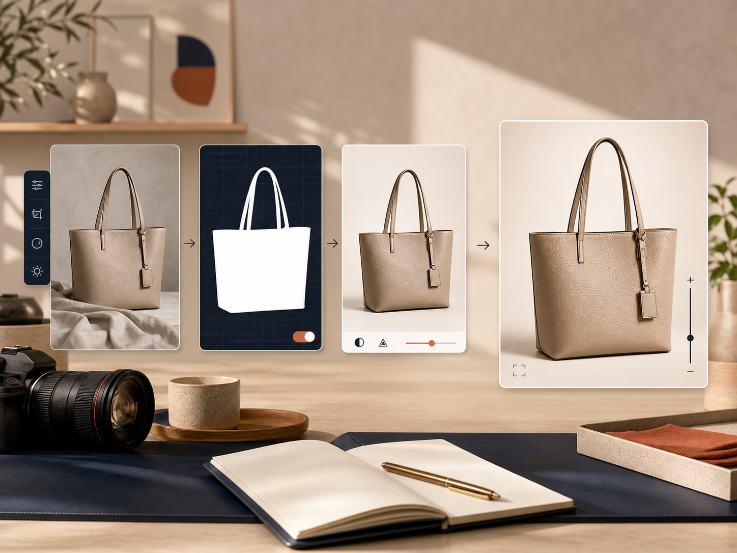
The fastest way to make Shopify product photos look better is not to generate more images. It is to make the base image easier to reuse.
Before I create anything new, I want the source photo to be readable at thumbnail size, sharp enough to crop, and neutral enough that the product still feels like the subject. That is where background removal, upscaling, and auto-enhance matter more than the fancy outputs.
The practical order is simple:
- Remove distractions from the background
- Fix obvious lighting or color issues
- Upscale if the image is too soft for product pages or ads
- Only then decide what the next output should be
Inside the app, that workflow lives in one place instead of bouncing between tools. The editor overview is useful because it shows the four things I actually care about: the source image, the tool panel, the canvas, and the gallery of product assets.
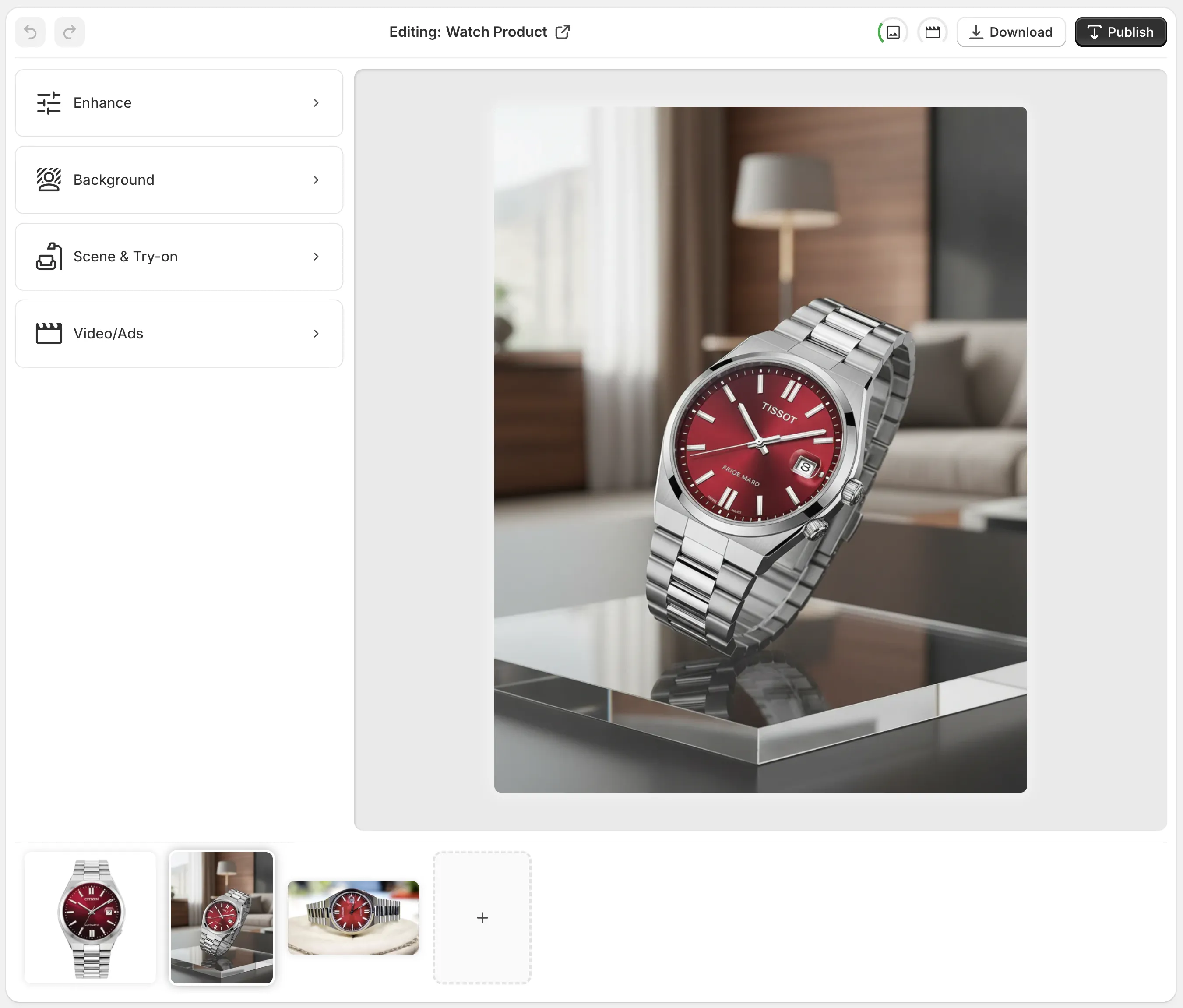
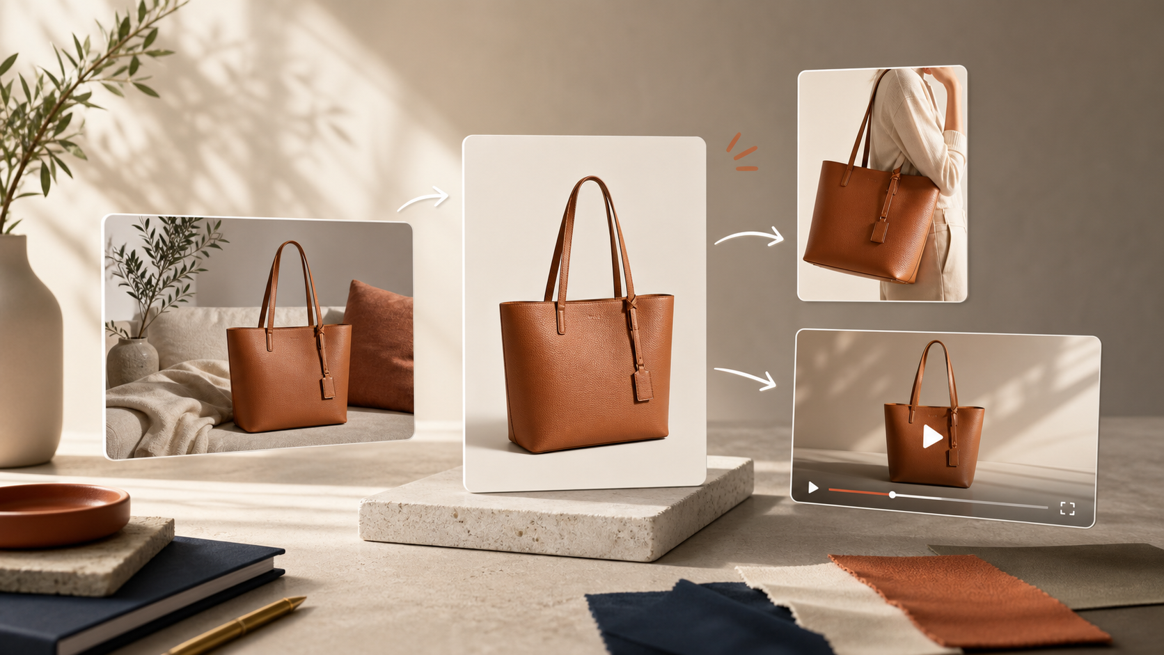
Choose The Output By Channel
The biggest mistake I see is using the same visual treatment for every use case. A product page image, a fashion try-on, and a social ad are solving different problems.
Here is the split I use:
| Need | Best Output | Why It Works |
|---|---|---|
| Product page clarity | Enhancement and background cleanup | Keeps the catalog clean and consistent |
| Fashion and accessories | AI try-on | Adds fit, scale, and body context fast |
| Home goods and lifestyle products | Object placement | Makes the product feel natural in a scene |
| Ads and social tests | UGC or B-roll video | Gives you motion without a full shoot |
| Branded packaging or merch | Mockup embedding | Keeps design work fast and repeatable |
For apparel, jewelry, and accessories, try-ons usually give the best speed-to-believability ratio. The product still looks like the product, but shoppers can picture it on a person instead of floating on white.

For home decor, beauty, or electronics, object placement usually wins. You want the product sitting in a believable environment, not forced onto a model where it does not belong.

If you want the broader catalog-angle version of this idea, How to Keep Shopify Product Photos Consistent Across Your Catalog is the companion post I would read next.
Keep The Review Step Small And Strict
AI saves time only if you keep the approval step lightweight and consistent.
When I review a generated asset, I check the same few things every time:
- Is the shadow direction believable?
- Does the color temperature match the brand?
- Does the product size look right in the scene?
- Does the image still feel like the same store?
- Would I put this on a product page without explaining it?
That last question matters more than it sounds. A visually impressive image is not useful if it looks like it belongs to a different brand or a different product line.
If you want the no-shoot approach in more detail, How to Build a No-Shoot Product Photo Workflow for Shopify goes deeper on keeping the whole process lean.
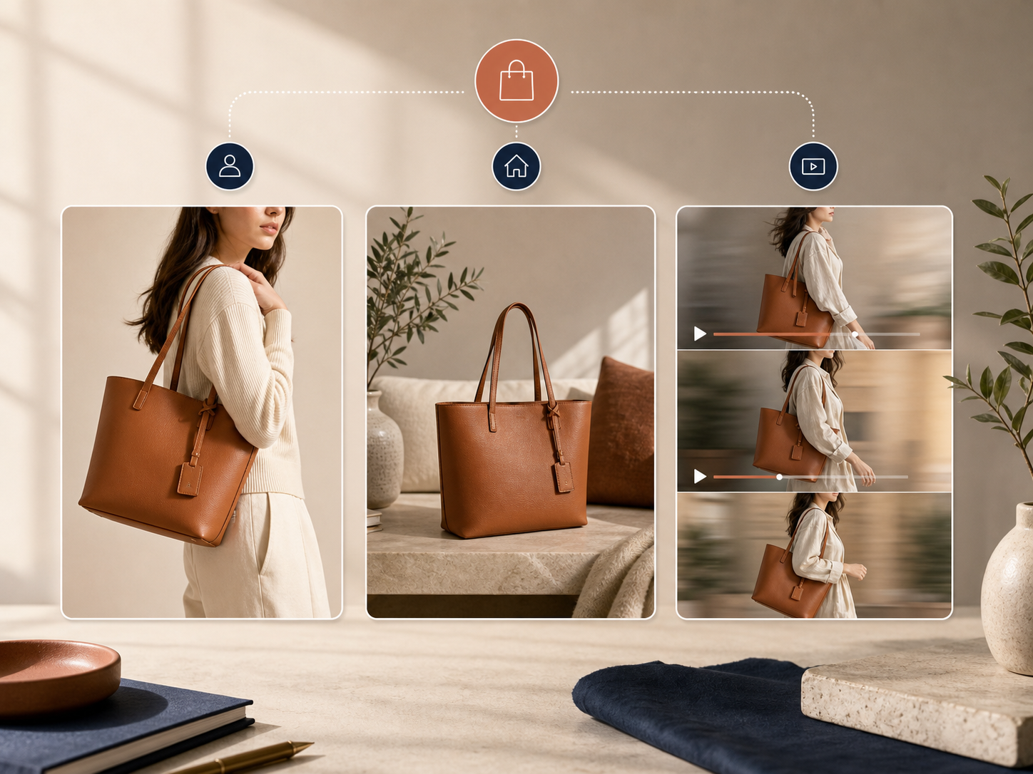
Use Motion Only Where It Adds Value
Static images are enough for many products, but ads and social content often need motion to get tested at all.
That is why I like having UGC-style videos and B-roll in the same workflow. It means I can turn the same source product into a few different formats without restarting the creative process from scratch.

The goal is not to make video for its own sake. The goal is to turn one product photo into more testable creative:
- a cleaner product page image
- a more contextual lifestyle shot
- a believable try-on
- a short motion asset for ads or social
That is also why I keep the workflow inside one app instead of splitting it across separate editing tools. Fewer handoffs usually means fewer mismatched visuals.
If you want the launch-oriented version of that thinking, How I Turned Plain Shopify Product Photos Into a Full Launch Kit shows how the same product image can support a broader launch plan.
What A Simple Shopify Photo System Looks Like
The most useful setup I have seen is not the most complicated one. It is the one a small team can repeat every week.
- Start with one good source photo.
- Clean it with background removal or enhancement.
- Generate the channel-specific output you actually need.
- Check the brand fit before publishing.
- Reuse the same workflow for the next SKU.
If the process works for one product, it usually works for the rest of the catalog with only small tweaks. That is the difference between a one-off edit and a real system.
For a more system-level take, How I Build a Shopify Visual System From One Product Photo is the closest related article.
The Short Version
If your product photography feels slow, the fix is usually not a bigger design project. It is a better sequence: clean the source, choose the output by channel, and keep the review step consistent.
That is why Supra AI Photo Studio is useful for Shopify stores. It turns one product photo into a catalog image, a lifestyle scene, a try-on, or a short video without forcing you to rebuild the asset every time.
Start with one SKU, one source image, and one goal. Test the landing page or the Shopify App Store listing, and see whether the workflow saves enough time to repeat.
The next step is not to make every product photo perfect. It is to make your next product photo reusable.