
I Stopped Maintaining Shopify Size Tables One Product at a Time
My least favourite kind of ecommerce work is the task that looks tiny, repeats forever, and quietly creates a customer-facing inconsistency. For an apparel catalog, that task is often the size table buried in every product description. A rise measurement changes, a supplier revises a conversion, and suddenly the same correction has to find its way through dozens of pages.
I wanted one place to make a sizing decision and one reliable path for that decision to reach the right products. The measurable outcome was not a flashy dashboard metric: it was eliminating the recurring hunt through product descriptions whenever sizing changed. The system that survived the test was a central chart plus clear assignment rules, rather than a better copy-and-paste process.

Why product descriptions are a poor database
A description is good at selling the feel of a jacket. It is a bad home for structured sizing data. Once a table is pasted into the description, it becomes hard to tell which version is current, where else it was reused, or whether two near-identical products need different fits. The maintenance cost grows with every SKU.
The failure mode is subtle: the merchandising team makes a correct change, but only some pages receive it. A shopper gets an old chart, support gets a sizing question, and the next audit becomes detective work. Before choosing tooling, I would inventory the current state by fit family. This fit-family audit is a useful way to separate genuinely shared patterns from products that only look similar.
The workflow I use instead
Supra Size Chart gives the workflow a proper source of truth inside Shopify. I create a chart in its spreadsheet-style editor, add per-column units and any measurement notes, then attach a reusable measurement guide where the garment needs one. The app stores the charts in the store's Shopify metaobjects and can import or export CSV and JSON, which matters to me because the data should remain portable.
For a simple example, a relaxed-fit tee group might share chest width, body length, and sleeve length columns. A fitted shirt group gets its own chart rather than being forced into the same table. That is a modest decision, but it is more useful than making one universal chart that is technically consistent and practically misleading. If you are deciding whether a product deserves its own chart, this guide to when a dedicated Shopify size chart earns its place is the decision rule I would start with.
Treat the measurement guide as part of the data
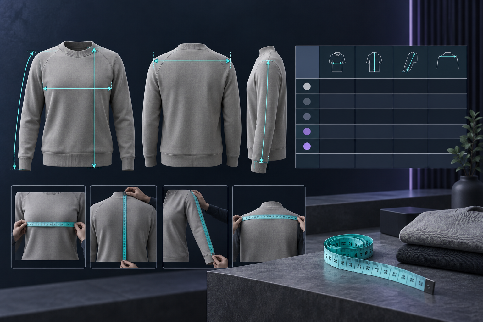
Numbers alone assume the shopper measures in the same place you did. That assumption is expensive. A labelled garment silhouette helps establish whether “chest” means a flat garment width or a body circumference, and whether length starts at the shoulder or collar.
I keep the instructions short: measure a similar garment laid flat; compare like with like; and use the measurement guide before choosing between sizes. For international traffic, I also turn on the metric/imperial counterpart where it applies. That removes needless mental conversion without turning the page into a dense sizing manual. A good product page can even turn the sizing question into a clear path, as this Shopify product-page decision-path approach illustrates.
Rules are where the time savings actually happen
The chart is only half the system. The operational payoff comes from assigning it by product, collection, product type, vendor, or tag. Instead of attaching a table one page at a time, I make the catalog attribute do the work. New products that enter the matching collection or receive the right tag are covered automatically; more specific rules can win when an exception needs a different chart.

That is also why I run a small QA pass after a collection update: open one product from each rule group, then one known exception. I check that the theme app block is visible, the right chart has rendered, and the measurement guide matches the garment. For a fuller pre-launch routine, use this size-chart audit checklist alongside your normal product-page checks.
Choosing the display mode
I would not optimize display mode in isolation. Inline works when sizing is the main purchase objection and the chart is compact. An accordion keeps the product page calm when the information is helpful but secondary. A modal trigger is useful for a fuller guide, particularly when the shopper needs to inspect a silhouette. Supra Size Chart's theme app block supports all three and follows the theme's own styling, so this is a merchandising decision rather than a redesign project.
The trade-off worth accepting
Centralizing charts adds an upfront classification step. Someone has to decide which products belong to a fit family, what the fallback should be, and when an exception wins. I think that is healthy friction: it makes the rules explicit instead of hiding decisions in product HTML.
If your store is still maintaining size tables by hand, start with one collection and one chart. Build the chart, add a measurement guide, create the assignment rule, and test it on three products before scaling. Install Supra Size Chart from the Shopify App Store when you are ready; it is free, with unlimited charts, rules, display modes, and CSV/JSON export. The goal is simple: make the next sizing update a single deliberate edit, not another catalog-wide scavenger hunt.