
I Measured Which Shopify Swatches Prevented Support Questions
A surprising amount of ecommerce support work is really interface translation. A shopper asks, ‘Which blue is this?’ or ‘Does the green version have the same material?’ The answer may be obvious to the person maintaining the catalog, but the product page has failed to carry that context.
I wanted to reduce that ambiguity before it became an inbox task, so I treated swatches as a small operations experiment rather than a decorative theme tweak. The outcome I cared about was simple: fewer pre-purchase option questions per collection launch, without making the storefront harder to maintain.
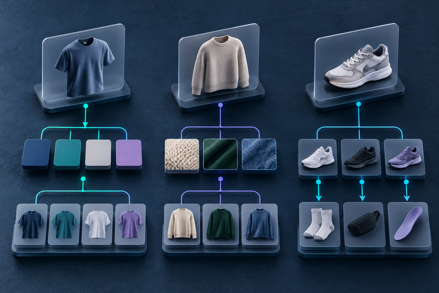
Supra Swatch Colors gave me three practical ways to express an option: a color swatch for a real variant, an image swatch when finish or pattern matters, and a linked product when each color deserves its own page. The app supports product and collection pages, so the useful work is deciding which signal tells the truth most efficiently.
The measurement I used
I did not pretend that every contact was caused by swatches. Instead, I tagged option-related questions during a launch window: color uncertainty, material uncertainty, availability confusion, and ‘where did the other version go?’ I compared that count with product-page sessions and checked the same products in the collection grid.
The metric was intentionally modest: option questions per 100 product-page sessions. You can use a support tag, a shared inbox label, or even a weekly spreadsheet. What matters is holding the definition steady long enough to see whether the presentation helps.
I also wrote down three leading indicators: variant-selection rate, clicks from collection cards to product pages, and the number of catalog edits needed after publishing. A lower question count is not a win if it comes from hiding options or creating a maintenance mess.
My decision rule: show the evidence shoppers need
Here is the rule set that survived the experiment:
- Use color swatches when color is the meaningful difference and the product remains otherwise the same.
- Use image swatches when texture, print, wash, or material changes the buying decision.
- Use linked products when each option has its own photos, title, inventory story, or merchandising plan.
That sounds elementary, but it stopped me from forcing every catalog relationship into a single variant structure. A neutral chip is fast to scan; a fabric close-up answers a different question; a separate product page needs a visible bridge back to its siblings. If you are still choosing a visual language, this product-image swatch workflow is a useful companion because it focuses on when imagery carries more information than a hex-like cue.
The before-and-after workflow I now use
I start with a ten-SKU sample, not the whole catalog. For each product I note the shopper question I am trying to prevent, the swatch model, and the source image or product grouping that supports it. Then I test the cards at the two places shoppers actually encounter them.
- Product page: Can someone identify the selected option without reading a paragraph?
- Collection page: Do the visible swatches create the right expectation before the click?
- Mobile: Are chips large enough to tap and are labels or tooltips understandable?
- Catalog handoff: Can another operator tell how to add the next color without reverse-engineering the first one?

The third check caught the most expensive issue: a clear product page and an unclear collection card make different promises. The shopper clicks expecting one option system and arrives at another. My earlier note on planning collection-page swatches before touching the theme still applies here: decide what the card must communicate before you configure it.
What actually reduced the follow-up work
The biggest improvement did not come from adding more chips. It came from using fewer, more honest signals. For a basic color variant, a named color swatch was enough. For knitwear with a visible weave, an image swatch removed the ‘is it cream or oatmeal?’ loop. For footwear where colorways had distinct photography and availability, linked products avoided cramming unrelated information into one variant picker.
That is where a configurable tool earns its place. Supra Swatch Colors supports both linked-product and variant swatches, plus image swatches and collection-page placement, without code. Its product site is worth reviewing if your current setup has forced one option model across unlike products. I also appreciate that the app is designed for multilingual storefronts; option labels are customer-facing language, not just internal taxonomy.
A QA gate that keeps the gain from evaporating
After publishing, I run a small consistency check. I select every swatch once on the product page, inspect the matching collection card, and confirm that a linked sibling provides a route back to the group. This is especially important after new colors arrive or product imagery changes.

If you need a more detailed visual consistency pass, this product-and-collection-page swatch guide is a solid checklist. For an adjacent perspective on the collection decision itself, see how to choose swatches for Shopify collections.
The ROI is quieter than a conversion-chart spike
I would not promise a universal conversion lift from a swatch change. The immediate payoff is operational: less time interpreting vague questions, fewer clarifying replies, and a catalog that can grow without each new color becoming a fresh exception. That gives support, merchandising, and content teams a shared rule instead of a recurring debate.
Start with ten products that generate the most option confusion. Choose the smallest swatch signal that accurately represents each choice, test it on product and collection pages, and count the questions for two weeks. If the questions fall and the catalog stays easier to maintain, expand the pattern. If not, you have learned exactly where shoppers still need evidence—not just a prettier picker.
My next action is to keep the measurement lightweight and rerun it after the next collection update. That is enough discipline to turn swatches from a styling decision into a system that saves real operator time.