
How To Add Color Swatches To Shopify Product Pages Without Code
If customers cannot quickly see what colors are available, they hesitate, bounce, or leave for a competitor. The fastest way to boost product discovery and reduce friction is to show clean, clickable color swatches right on your Shopify product pages — without touching your theme code.
In this walkthrough, you will learn how to add color swatches to Shopify product pages (and collection pages) in minutes using Supra Swatch Colors. This highly customizable app handles both variant-based swatches and linked-product swatches, loads instantly, and works across all Shopify themes with multilingual support.
Quick start for busy merchants
- Install Supra Swatch Colors from the Shopify App Store: https://apps.shopify.com/swatch-colors-ultimator
- Turn your Color option into beautiful swatches — no code required
- Optionally link separate products with swatches (perfect for color-per-product catalogs)
- Enable swatches on collection pages in one click
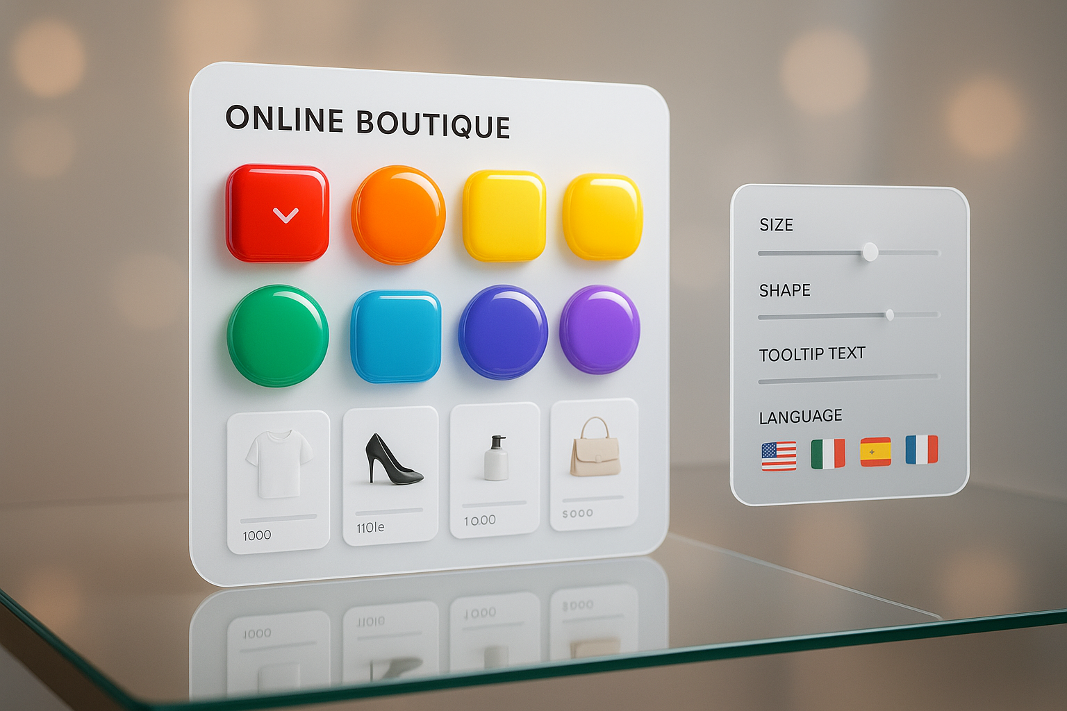
- Customize size, shape, tooltips, labels, and style to match your brand
Why color swatches matter for Shopify stores
- Higher conversion: Shoppers can immediately visualize options and commit faster
- Fewer returns: Clear color choices reduce confusion
- Better UX on mobile: Tapping swatches is easier than opening long dropdowns
- Improved product discovery: Collection-page swatches expose choices earlier in the journey
What you need
- A Shopify store with products and a Color option or separate products per color
- Supra Swatch Colors installed: https://apps.shopify.com/swatch-colors-ultimator
- Optional: product images or texture tiles if you want image-based swatches (fabric, wood, patterns)
Step-by-step: add swatches to product pages without code
- Install Supra Swatch Colors
- Go to https://apps.shopify.com/swatch-colors-ultimator and click Add app
- Approve permissions and open the app in your Shopify admin
- Auto-detect your color options
- Supra Swatch Colors can auto-detect the Color option used in your store and propose a starter configuration
- You can also map alternative names (e.g., Colour, Shade, Tone) to the Color option for multilingual stores
- Turn variant options into swatches
- If your product uses variants (Size, Color, etc.), switch the Color option to swatches in the app
- Choose from 20+ styles: circular, rounded square, pill, outline, image-based tiles, and more
- Adjust size, spacing, border, tooltip, label visibility, and typography to match your brand

- Use linked-product swatches (if each color is its own product)
- Many catalogs split colors into separate products for cleaner SKUs. Supra Swatch Colors lets you group these into a single visual chooser
- Create a product group, select the products that belong together, and assign swatch colors or images
- Customers can toggle between colors without leaving the page, while each color remains its own product URL for clean merchandising and SEO structure
- Add swatches to collection pages (no code)
- Turn on collection page swatches in the app so shoppers can see every color directly from product tiles
- This dramatically improves browsing and reduces extra clicks, especially on mobile

- Match your brand with granular style controls
- Choose color or image swatches: use HEX, RGB, or pull from product images (great for textures)
- Customize hover effects, active states, borders, and shadows
- Enable tooltips with human-friendly color names (e.g., Midnight Navy instead of #001F3F)
- Align labels and font styles with your theme for a seamless, on-brand look

- Go multilingual with confidence
- The app fully supports multilingual storefronts
- Localize tooltips and labels, and map Color option names per language
- Ensure swatch names remain readable and consistent across locales
- Speed and compatibility — handled for you
- Swatches load instantly and work with all Shopify themes
- No theme edits or liquid code required
- Works on both product and collection pages for unified UX
Pro tips to get the most from your swatches
- Use image tiles for textured products: fabric, knit, leather, wood, stone, or patterns
- Keep contrast in mind: add a thin border on very light or very dark swatches to ensure they stand out
- Name colors clearly: use tooltips like Deep Olive instead of generic Green for fewer returns
- Maintain consistency: if you sell across regions, map equivalent color names to avoid confusion
- Consider linked products when you need distinct URLs per color (helpful for merchandising and analytics)
Video tutorials (2–5 minutes)
- App overview: https://www.youtube.com/watch?v=k8uyugxH9To
- Getting started step by step: https://www.youtube.com/watch?v=K_2l9G1ibIo
- Link separate products with color swatches: https://www.youtube.com/watch?v=H9LOX-vOjYI
- Add swatches to collection pages: https://www.youtube.com/watch?v=FKZQpBrAJQQ
When to use variant swatches vs linked-product swatches
- Variant swatches are ideal when your product has one detail page and Color is a simple option. It’s fast, clean, and keeps inventory under one SKU family
- Linked-product swatches are perfect when each color deserves its own images, content, price, or inventory — but you still want an effortless color chooser for customers
Common pitfalls (and how this app avoids them)
- Theme edits required: Not here. Everything is no-code
- Missing collection-page swatches: Built-in, toggle on in the app
- Sluggish loading: Swatches are optimized to appear instantly
- Limited styling: Choose from 20+ styles and full controls for size, shape, tooltip, and labels
- Language gaps: Full multilingual support built in
SEO and UX benefits you can see
- Reduce pogo-sticking: Shoppers find the right color faster
- Improve catalog depth on listing pages: Collection swatches surface variety early
- Support content-rich color experiences: Linked-product swatches keep clean URLs per color while still offering a single, cohesive chooser
Next steps: add swatches today (no code)
- Install Supra Swatch Colors on the Shopify App Store: https://apps.shopify.com/swatch-colors-ultimator
- Explore the app site for more details and examples: https://supra-swatch-colors.sktch.io/
- Configure your first product in minutes and preview on both product and collection pages

Your store’s color story should be obvious at a glance. With Supra Swatch Colors, you can add color swatches to Shopify product pages and collection pages without code, tailor every visual detail to your brand, and give customers the confidence to buy. Install the app, flip the switch, and watch your color options come to life.