How to Add Color Swatches to Shopify Product and Collection Pages Without Code
If you want shoppers to find the exact color or pattern they love—fast—color swatches on product and collection pages are a must. The good news: you can add beautiful, blazing‑fast swatches in minutes without touching theme code.
In this guide, you’ll learn how to add color and image swatches to product and collection pages using Supra Swatch Colors—a highly customizable app that works with all themes, supports multilingual stores, and loads instantly. You’ll also get expert tips to make your swatches accessible, on-brand, and conversion‑ready.
What you’ll need
- A Shopify store with products and variants (or separate products for each color)
- The free trial of Supra Swatch Colors
- 10–15 minutes for setup
Get started now: Install Supra Swatch Colors on the Shopify App Store: https://apps.shopify.com/swatch-colors-ultimator
Why swatches matter (and why code-free is better)
- Faster product discovery: Shoppers can preview colors without clicking into product pages.
- Higher CTR on collection pages: Swatches entice clicks on the exact variant customers want.
- Fewer returns: Visual color cues reduce confusion versus text-only dropdowns.
- No theme edits needed: Keep your theme clean, avoid regressions during updates, and ship faster.
Step-by-step: Add color swatches without code
- Install the app
- Go to: https://apps.shopify.com/swatch-colors-ultimator
- Click Add app and complete installation.
- The app auto-detects your theme and prepares a safe, no-code integration.
- Choose your swatch mode
Supra Swatch Colors supports two powerful approaches:
- Variant-based swatches: Convert your existing variant options (e.g., Color) into clickable color/image swatches on the product page.
- Linked-product swatches: If each color is a separate product page, link them together so colors display as swatches and seamlessly switch between product pages.

- Auto-detect colors or use images
- Auto-detect: The app can recognize color names (e.g., "Navy", "Forest Green") and instantly create matching swatches—ideal for fast setup.
- Image-based: Prefer exact fabric/pattern previews? Use product images or custom swatch images for precise visual matches.
Pro tip: For colorways with prints or textures, image swatches dramatically improve click-through.
- Enable on product pages (no code)
- In the app’s Product Page settings, toggle swatches on.
- Choose the Option Name for conversion (e.g., Color).
- Decide fallback behavior (what happens if an image or color isn’t found) to ensure consistency.
- Enable on collection pages (one toggle)
- Switch on Collection Page swatches in the app.
- Pick which options show under each product card.
- Choose hover or click behavior to update the featured image.

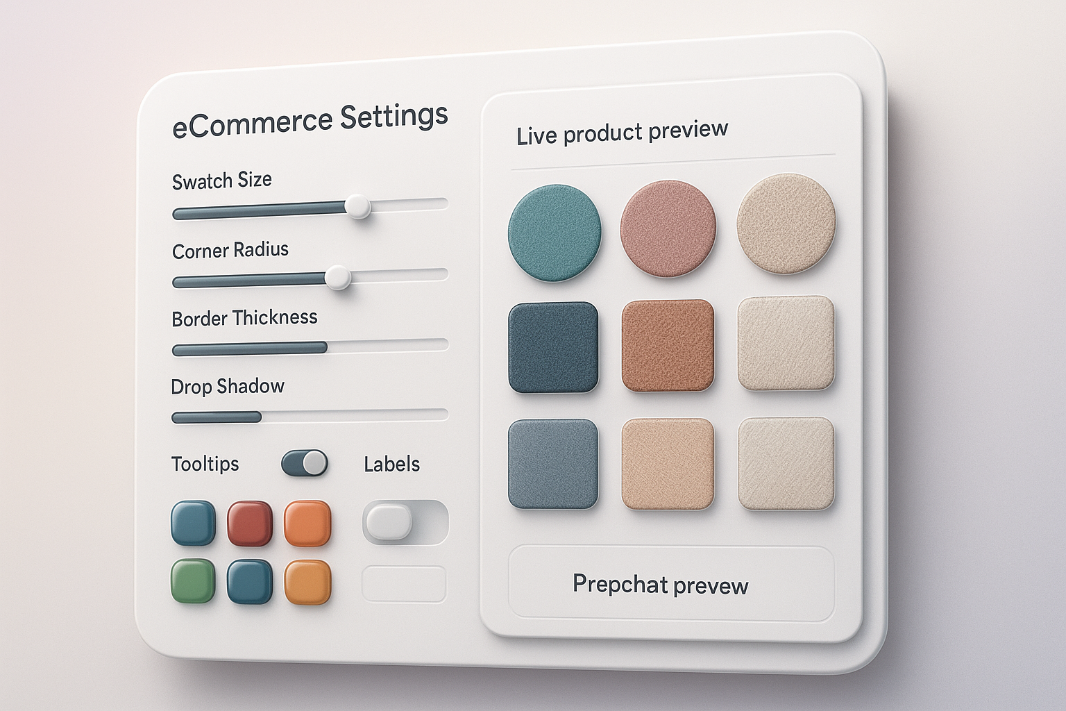
- Customize the look to match your brand
- Styles: 20+ presets for size, shape (circle/square/pill), borders, and shadows
- Labels and tooltips: Show color names on hover or as text labels for accessibility
- Selection states: Clear active/disabled indicators for a cleaner UX
- Typography: Match your storefront’s font and weight
- Group products (for separate color product pages)
- Use Product Grouping to link standalone products into one swatch family.
- Assign a shared handle or tag; the app displays these as cohesive color swatches.
Result: Shoppers can switch colors without leaving the page or losing context.
- Multilingual and performance settings
- Translate swatch names and tooltips for every language you sell in.
- Swatches load instantly with the app’s lightweight script, keeping Core Web Vitals healthy.
- Publish and QA
- Preview on a staging theme or use the app preview.
- Test on desktop and mobile: product pages, collection pages, and quick-view modals.
- Validate accessibility: ensure tooltips and labels are on for users who can’t distinguish colors.
Watch a 2-minute overview
- Video: Supra Swatch Colors — Shopify App to add Color Swatches to Products
https://www.youtube.com/watch?v=k8uyugxH9To
Best practices for swatches that convert
- Use real textures for patterned items: Image swatches set the right expectations.
- Name consistently: Keep color names concise and readable (e.g., “Navy” vs. “Dark Blue Navy #04”).
- Prioritize contrast: Borders help light swatches stand out against white backgrounds.
- Show availability: Gray out out-of-stock swatches instead of hiding them, so shoppers understand options.
- Keep interaction clear: Use a visible selected state and optional labels for accessibility.
- Mirror your collections: If you show swatches on product pages, also show them on collection pages for a consistent journey.
Why choose Supra Swatch Colors
- Highly customizable: 20+ styles, tooltips, labels, borders, sizes, shapes, and typography controls.
- Works everywhere: Product and collection pages; all themes; multilingual shops.
- Link products or variants: Use either approach—or both—depending on your catalog.
- Set up at scale: Manage thousands of swatches and product groups with ease.
- No code required: One-click activation; keeps themes clean and maintainable.
- Fast by design: Instant-loading swatches for a buttery browsing experience.

Common questions
- Can I map custom hex colors? Yes—define exact hex codes or use images for perfect accuracy.
- Will it work with my theme? Yes—the app supports all themes and requires no template edits.
- Does it support multiple languages? Yes—full multilingual support for tooltips and labels.
- Can I connect separate products as swatches? Absolutely—use product grouping to create linked-product swatches.
Quick setup checklist
Install Supra Swatch Colors
Choose variant-based or linked-product swatches
Auto-detect colors or upload custom/image swatches
Enable on product pages and collection pages
Customize size, shape, borders, tooltips, and labels
Test on mobile and desktop; confirm speed and accessibility
Ready to add color swatches—without code?
- Install on the Shopify App Store: https://apps.shopify.com/swatch-colors-ultimator
- Learn more on the website: https://supra-swatch-colors.sktch.io/
Give your shoppers a clear, fast, and beautiful path to the exact color they want—on every page, in every language, without touching a line of code.