How To Add Color Swatches In Shopify Without Editing Theme Code
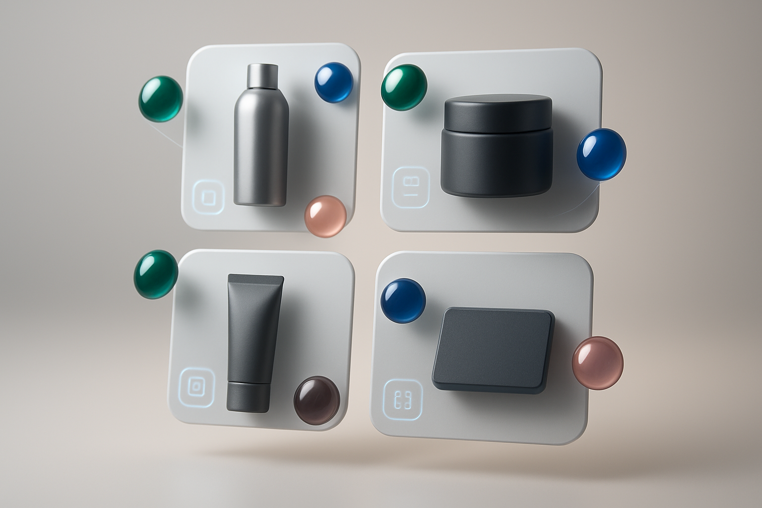
If your shoppers can’t instantly see which colors or patterns you offer, they’ll click away. The fastest way to boost conversions on product and collection pages is to show clickable color swatches—without touching your theme code.
In this guide, you’ll learn the exact no-code method to add beautiful, fast-loading swatches to Shopify using Supra Swatch Colors. You’ll also see how to link separate products via swatches (great for brands that separate colors by product pages), customize every detail, and roll it out on collection pages in minutes.
Why add color swatches in Shopify (the no‑code way)
- Faster product discovery: Shoppers can see available colors without opening each product.
- Higher conversion and fewer returns: Visual selection reduces uncertainty.
- Cleaner navigation: Use swatches to link separate product pages for the same style.
- Better UX on mobile: Tap-friendly swatches outperform dropdowns.
The problem: Many setups require editing theme code, which risks breaking your theme and slowing you down. The solution: Supra Swatch Colors—an all-in-one, no-code app that works on every Shopify theme, supports multilingual stores, and loads instantly.
What you’ll get with Supra Swatch Colors
- Highly customizable color and image swatches with 20+ styles
- Works both ways: transform variant options into swatches or link separate products with swatches
- Product page and collection page integration (no code, all themes)
- Auto-detect store colors or use product images to set up quickly
- Full control over size, shape, labels, fonts, tooltips, and more
- Built for multilingual shops and high-volume catalogs
Step-by-step: Add Shopify color swatches without editing theme code
- Install the app
- Go to the Shopify App Store and install: https://apps.shopify.com/swatch-colors-ultimator.
- Open the app in your store’s admin.
- Choose your swatch mode
- Variant Swatches: Convert your existing color option (e.g., Option name: Color) into clickable swatches.
- Linked-Product Swatches: Group separate product pages (e.g., "Tee – Black", "Tee – Blue") and display them as swatches on each other’s pages.

- Auto-detect colors or use product images
- Auto-detect: The app can scan and map common color names (e.g., Navy, Burgundy, Ivory) to swatches instantly.
- Use product images: Great for patterns, textures, prints, or finishes (e.g., marble, woodgrain, tie-dye). Select an image swatch for pixel-perfect accuracy.
- Enable on product pages (no code)
- Toggle the product page integration inside the app.
- Choose the target option (usually "Color").
- Set behavior for out-of-stock variants (dim, cross-out, or hide) to guide expectations.
- Enable on collection pages (no code)
- Toggle collection page swatches to show colors without opening product pages—a major UX win.
- Configure how many swatches to show (with a "+ more" indicator if needed).

- Match your brand style (20+ presets)
- Size & shape: Circles, rounded squares, pills—resize for mobile comfort.
- Labels & tooltips: Show color names on hover/tap; customize fonts and label placement.
- Borders & states: Configure active/hover states, focus rings, and disabled styles.
- Speed: Swatches load instantly for a seamless, premium feel.
- Multilingual & accessibility
- Translate labels and tooltips for multilingual shops.
- Ensure color names are readable and include descriptive tooltips (e.g., "Slate Blue – Out of Stock").
- Test, then publish
- Preview on a few products and across devices.
- Validate collection page swatches and linked-product groups.
- Publish your changes with confidence—no theme edits required.
Helpful videos
- Getting Started Tutorial: https://www.youtube.com/watch?v=K_2l9G1ibIo
- How to Link Products with Swatches: https://www.youtube.com/watch?v=H9LOX-vOjYI
- Collection Page Swatches Setup: https://www.youtube.com/watch?v=FKZQpBrAJQQ
Advanced tips for higher conversions
- Use image swatches for patterns and finishes: When a solid color swatch can’t tell the full story (e.g., terrazzo, camo, floral), switch to image-based swatches for clarity.
- Group separate products by color family: If each color is its own product, use Linked-Product Swatches to present them as one experience. This declutters navigation and increases cross-color views.
- Show limited stock clearly: Style out-of-stock swatches with a subtle slash or low opacity to set expectations without disappointing clicks.
- Keep labeling consistent: Standardize color names (e.g., "Light Blue" vs. "Sky") to reduce confusion and improve searchability.
- Optimize for mobile taps: Slightly larger swatch sizes and healthy spacing improve tap accuracy.
Why this beats DIY code and many other apps
- Truly no code: All integrations for product and collection pages work out of the box.
- Works with all themes: No fragile theme edits, no version surprises.
- Instant-load swatches: Smooth UI that feels native and fast.
- Deep customization: Size, shape, borders, labels, tooltips, fonts—20+ presets to mix and match.
- Multilingual support: Built for global stores and localized experiences.
- Scales with your catalog: Manage thousands of swatches and product groups efficiently.

Common questions (FAQ)
- Will it slow my store down?
The app is designed for instant-loading swatches, so your product and collection pages feel fast and responsive.
- Does it work with my theme (e.g., free and premium themes)?
Yes. It’s built to work with all Shopify themes and requires no code edits.
- Can I use hex codes instead of names?
Yes. You can map exact HEX/RGB values for perfect brand color matching.
- Can I localize color names for different languages?
Yes. Full multilingual support is included so you can translate labels and tooltips.
- What if my colors are separate products rather than variants?
Use Linked-Product Swatches to group them visually on each product page (and optionally on collection pages) so shoppers can switch colors without changing context.
Get started in minutes
Add professional, conversion-boosting swatches to your Shopify store—no developer, no theme edits, no surprises. Start with variant swatches or link separate products, then fine-tune the design to match your brand.
- Install on the Shopify App Store: https://apps.shopify.com/swatch-colors-ultimator
- Learn more on the website: https://supra-swatch-colors.sktch.io/
Ready to upgrade your product and collection pages? Install Supra Swatch Colors now and ship pixel-perfect swatches today.