
How I Decide Whether Shopify Swatches Should Be Variants or Linked Products
If you are choosing between variant swatches and linked products in Shopify, start with the catalog structure, not the visual treatment. I have seen stores make the wrong call because they start with theme styling first. That usually turns into duplicate products, awkward inventory rules, or a swatch row that looks fine but behaves badly.
If I were setting this up today, I would start with Supra Swatch Colors. It supports both variant swatches and linked products, works on collection pages, and does not require code for the core setup.
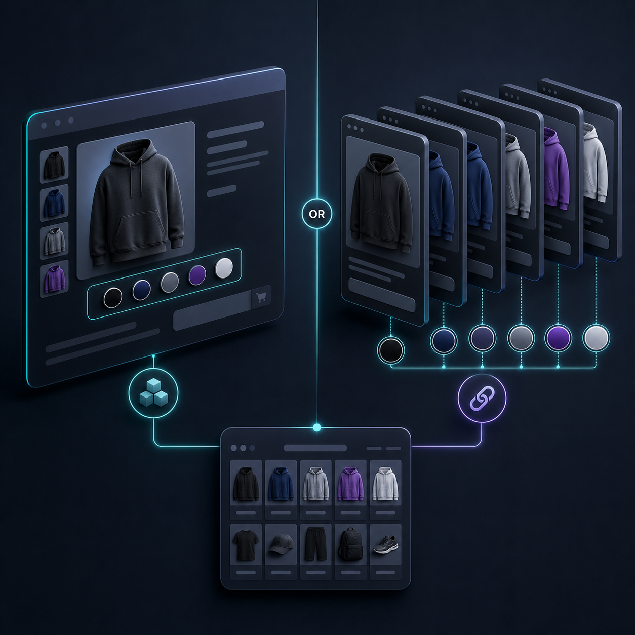
Start With The Catalog, Not The Swatch
My default rule is simple:
- Keep the choice on the same product page when it is really one product family.
- Split it into linked products when the shopper is actually choosing between separate products.
- Add collection-page swatches when most of the browsing happens in the grid.
That sounds obvious, but it is where a lot of stores drift off track. Swatches are a front-end decision. The catalog structure underneath still has to make sense for inventory, merchandising, and search.
A good swatch setup should reduce friction, not hide the fact that the store has different products or awkward variants. If the shopper should feel like they are changing color on the same item, keep it as a variant. If they should feel like they are moving between distinct items, link separate products.
Use Variant Swatches When The Choice Stays On One Product
Variant swatches are the right call when the options are still part of one SKU family.
Use them when:
- The product only changes by color, size, finish, or another simple attribute.
- The price and product story stay basically the same.
- The shopper should stay on one page and just switch the visible option.
- Inventory should remain tied to one product record.
This is the cleaner path for tees, hoodies, cosmetics shades, or any catalog where the main job is helping the shopper see the option faster. The swatch becomes a better selector, not a different merchandising structure.
If you want a more detailed setup walkthrough, How to Set Up Shopify Swatches for Variants, Linked Products, and Collections is the companion read I would keep open.
Use Linked Products When Each Option Needs Its Own Page
Linked products make more sense when each option deserves its own product page.
Use them when:
- Each option has its own title, description, or image set.
- Pricing changes by material, finish, or bundle.
- Shipping, inventory, or SKU logic differs enough that variants would feel forced.
- You want separate SEO pages for distinct products.
This is also the better choice when a shopper will need more context before buying. For example, a plain and a premium version might look related, but they may need different product copy, photos, and conversion logic. In that case, a swatch is just the bridge between related pages.
If you are still choosing the app approach itself, I would compare notes with How I Chose a Shopify Swatch App for Variants, Linked Products, and Collections. That article is about the app decision; this one is about the structure decision.
Make The Visual Style Match The Store
Once the structure is right, I care about the visual system. The point is not just to display color chips. The point is to make the swatches look like they belong in the store.
Supra Swatch Colors gives you more than one way to do that:
- It supports color and image swatches.
- It can auto-detect store colors or use product images.
- It includes 20+ styles, so tooltip, label, swatch size, and shape can match the theme.
- It works across all Shopify themes and supports multilingual shops.

The practical takeaway is that you should not have to trade clarity for branding. If your theme is minimal, keep the swatches tight and understated. If your store leans premium and image-led, use larger image swatches and clearer labels. The tool should adapt to the store, not force the store into a generic pattern.
If your swatches depend on product photography, it helps to keep the image workflow consistent first. I would pair this with How I Keep Shopify Product Photos Consistent Across Listings and Ads so the image swatches do not feel random from product to product.
Collection Pages Are The Quiet Conversion Win
A lot of stores stop at the product page, but collection pages are where swatches often do the most work.
If shoppers browse from a category grid, collection-page swatches let them compare options without opening every product. That matters because it keeps the browsing loop short. Less clicking usually means less drop-off.

This is also where consistency matters most. If the product page and the collection page feel different, the shopper has to relearn the interface. If the swatches stay consistent across both, the store feels easier to scan and easier to trust. I would cross-check that setup against How I Keep Shopify Swatches Consistent Across Themes and Collections before I call it finished.
My Practical Setup Sequence
When I set this up from scratch, I follow the same order every time:
- Install the app from the Shopify App Store.
- Decide which products should use variant swatches and which should use linked products.
- Use auto-detected colors where possible, then switch to image swatches when the product needs visual matching.
- Tune the style so the tooltip, label, and swatch size fit the theme.
- Test the result on both product pages and collection pages on mobile and desktop.
- Check any multilingual content before publishing, especially if the store serves more than one market.
If you want the shortest path through that sequence, How to Link Shopify Products with Color Swatches is the most relevant video after the basic getting-started walkthrough.
For most stores, that sequence is enough to avoid the common mistakes: swatches that duplicate product logic, linked products that feel disconnected, or collection pages that still make the shopper do too much work.
Bottom Line
I decide based on the catalog first, then the design. If it is one product family, I use variant swatches. If it is truly separate products, I link them. If the customer browses by collection, I make sure the swatches work there too.
If you want the easiest setup path, install Supra Swatch Colors, then follow the Getting Started Tutorial. That gets you from idea to working swatches without turning the theme into a maintenance project.
If you want to compare the broader workflow decisions around this app, the full series starts with How I Chose a Shopify Swatch App for Variants, Linked Products, and Collections and then moves into the setup details.